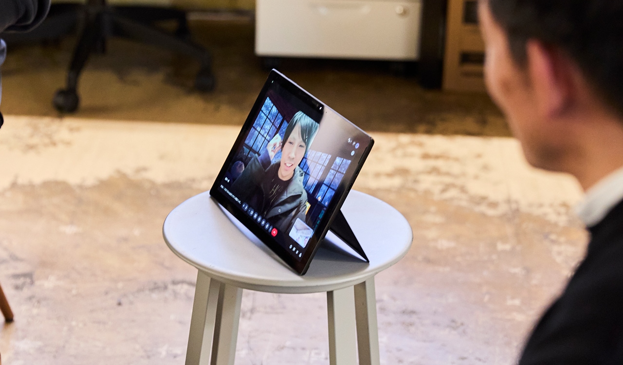
The IN FOCUS corporate website has been renewed in seven years. For this project, we collaborated with our long-time partner, CREBAR FLAVOR, who handled the implementation. We spoke with six members involved in the project about the process of “building while moving,” as well as the thinking behind why we chose to renew the site now.
Participants
IN FOCUS
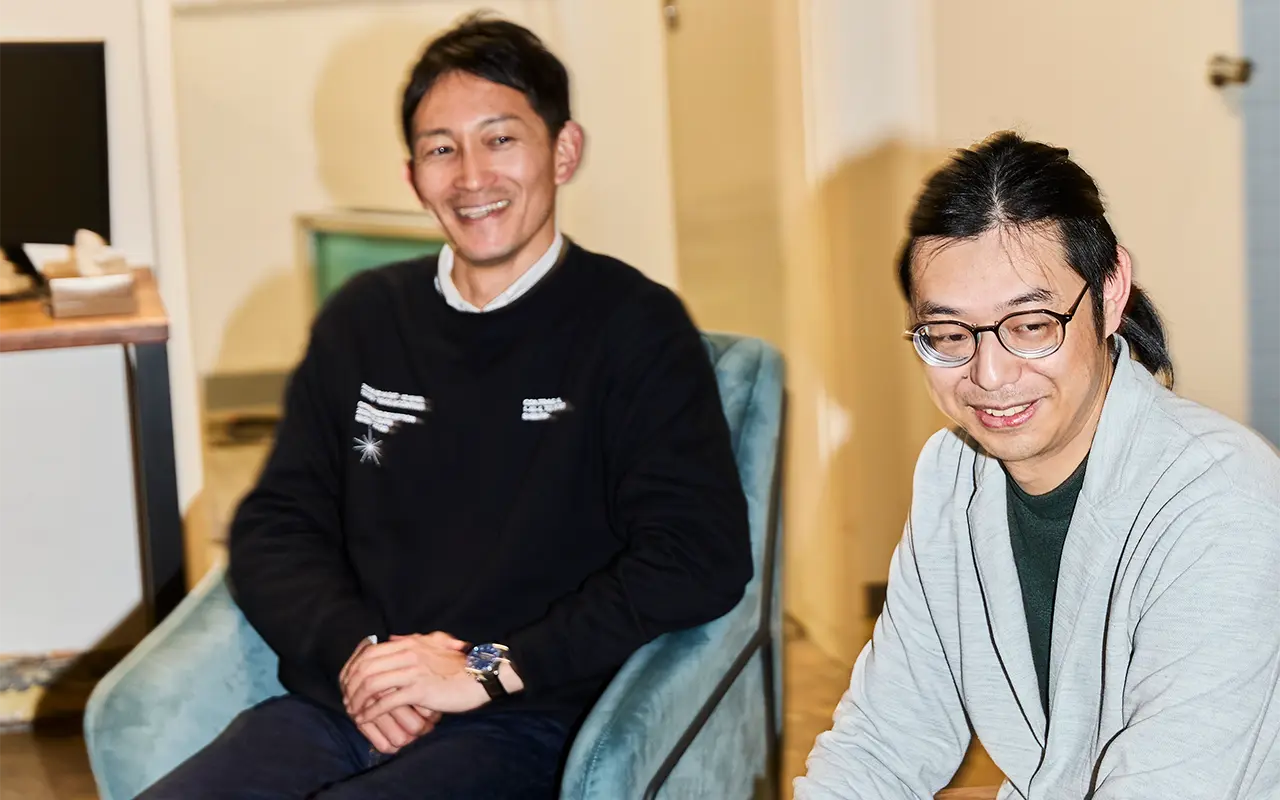
・Iguchi (CEO)|Overall direction and project vision
・Kaneishi (Chief Creative Director)|Creative direction and project lead
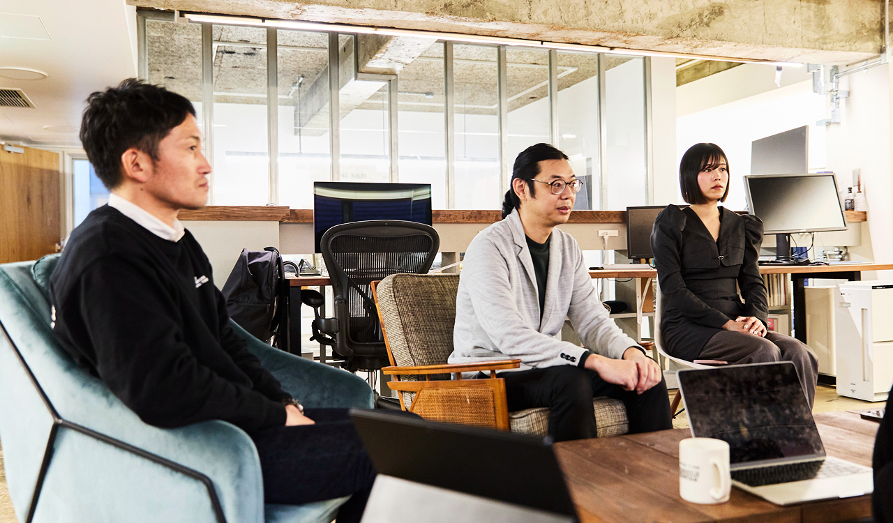
・Yamada (Web Designer)|Design
CREBAR FLAVOR (https://cfv.co.jp/)
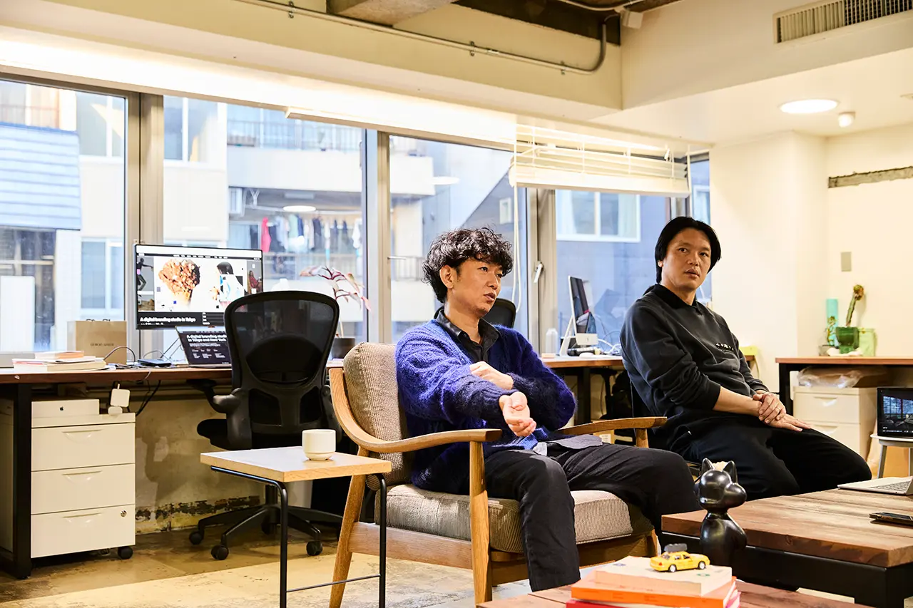
・Mr. Kobataku (CEO)|Initial project structuring
・Mr. Kurosu (CEO and CTO)|Technical direction, infrastructure, CMS
・Mr. Kazu (Web Engineer)|Front-end implementation
ー It Started with a Simple Question: “Why Don’t We Work Together?”
Iguchi:
It all started when Koba reached out and said, “Why don’t we do something together?” We thought about what that could be for a while and then realized that it might be about time to revisit the IN FOCUS corporate site. It had been around seven years since the last renewal, and some issues had started to surface.
Kaneishi:
Seven years ago, we tried too hard to “make something cool,” and ended up overcomplicating things. Based on that experience, this time we intentionally kept things lighter and focused on creating a process that would be easy to get started.
We began with a focus on solving functional issues—like loading speed and CMS improvements—and thought we’d refine the design along the way.
We knew that once we got into it, we’d naturally start caring more, so the idea was to raise the level later, once that switch flipped.
I quickly put together the base design with Wang, who was still with us at the time, and later handed it over to Yamada, who had just joined the company.
Yamada:
Before joining the company, I used to look at the site and think, “This is such a cool website.” I never imagined I would end up working on its renewal (laughs).
Iguchi:
We’ve worked with CREBAR FLAVOR for a long time, so we understand each other’s personalities and working styles. We’ve collaborated on many projects together, including BLUE NOTE JAPAN, ASOBI SYSTEM, and TOGA ARCHIVES. The flexibility we had this time was only possible because of that trust. Simply put, we could do this because we have a good relationship.
Mr. Kobataku:
Iguchi and I even go to the sauna together (laughs).
The timing was also perfect. We had been thinking about asking IN FOCUS to design our new website. So we decided to “renew both of our sites together, each playing to our strengths.” I immediately spoke with our co-representative, Kurosu.
Mr. Kurosu:
IN FOCUS’s work keeps getting better every year, so I was honestly a bit nervous about “what kind of design would come in.” I expected something very high-level. Kazu, who handled the front-end, was also a bit nervous (laughs).
Mr. Kazu:
Before we started, I was worried about “whether I’d be able to implement everything properly.” I expected things like 3D or complex effects, so I prepared for that—but in the end, none of that really came up (laughs).
ー Another Intention Behind the Renewal — Why It Felt Like the Right Time
Iguchi:
Beyond functionality, there was another major issue: “It wasn’t clear what kind of company we are.” We would sometimes hear from clients, “I didn’t realize you also do this.” We felt we needed to communicate our strengths, having multiple areas of expertise, more clearly.
Kaneishi:
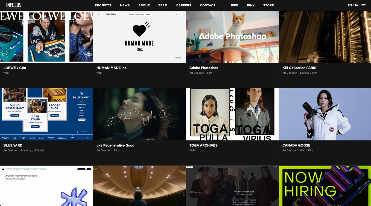
On the new site, we visualized what we mean by “digital branding” through a video at the top. Below that, projects are arranged in a tiled layout so that our areas of work can be seen at a glance. The layout itself is quite standard, but we increased the density of information by using video thumbnails and added playful elements to express the IN FOCUS tone.
Previously, we tried to make the site itself carry a strong sense of “identity.” Since then, we’ve built up a large body of work, and each project already reflects who we are. After seven years, simply placing them together now communicates our “identity” and “strengths” more directly.
Iguchi:
The previous website was created in 2018. Since then, both the company itself and the environment around us have changed significantly. We launched the creative studio CONTRAST, relocated our office, and fully started operating IN FOCUS NEW YORK. What we do has changed, and so has the structure of the company itself.
At the time, we had around 15 employees. Now we’ve grown to more than 40. With the organization changing this much, it started to feel strange for the website to remain the same. I wanted to take action for the team as well. It felt like, “Now that the company has entered its next phase, maybe we can finally organize things properly.”
Mr. Kurosu:
When we first saw the design proposal, I was honestly a little surprised—in a different way than expected. My first impression was, “It’s much simpler than I imagined.” But at the same time, the work itself was already strong enough that “simply laying the projects out was enough to make it work.” In fashion terms, it felt like someone who looks effortlessly good in just a plain T-shirt. It didn’t need unnecessary decoration to feel cool.
Mr. Kazu:
My first impression was also, “This is really simple.” But when you look closely, the arrangement of the images, the spacing, and the typography were all handled very carefully. Nothing was just casually placed there—everything had intention behind it.
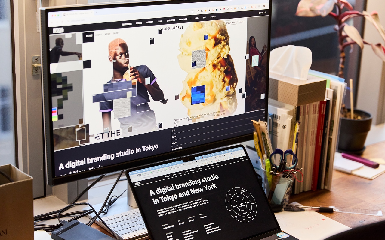
Once implementation started, there were many points where I had to think carefully about “how to structure things.” As the site gradually took shape, we went back and forth with the IN FOCUS team many times, especially regarding spacing and font-size adjustments.
ー Technical Challenges and Thoughtful System Design
Mr. Kurosu:
One of the major challenges in this project was updating not only the surface-level design, but also the underlying structure behind it. To improve loading speed, we adopted a Jamstack architecture with a headless CMS. The previous site also had a pseudo-headless setup using Nuxt.js, but the overall system had become outdated.
Mr. Kazu:
For me personally, one of the biggest challenges was adopting Astro, a framework I hadn’t worked with before.
With conventional API-based architectures, there’s inevitably a slight delay between fetching data and displaying it. By using Astro, we were able to pre-generate pages in advance, which significantly reduced the gap in loading time. Technically, it was also a new challenge for me.
Mr. Kurosu:
For front-end hosting, we used Cloudflare Pages. Building a server environment from scratch can be quite time-consuming, but Cloudflare made things much easier with a simple setup for GitHub integration, domain configuration, and deployment workflows. Most importantly, the free tier was more than enough for this project. That allowed us to significantly reduce both server-side costs and implementation time.
We were also doing some fairly complex things in terms of CMS integration, and I think it would have been much more difficult without Cloudflare.
Iguchi:
Even a site like IN FOCUS can operate within the free tier if it’s designed properly. I think having those kinds of options available is important.
Mr. Kurosu:
There were already hundreds of news and project posts on the previous site, so we wanted to preserve as much of that data as possible. Since parts of the information structure had changed in the new site, we converted the old data and migrated it in a way that allowed us to reuse as much as we could.
Kaneishi:
That really helped us. We were mentally prepared for the possibility of having to manually rebuild everything from scratch, so being able to avoid most of that work and only make adjustments afterward was a huge relief.
Many things became possible on the new site that we couldn’t do before—adding search and filtering functions, for example, or allowing more flexible layouts within project pages. They handled even the smallest details very carefully.
Iguchi:
One thing I personally appreciated was being able to control the display order of projects separately for each category. For example, the order we want to show for web projects is different from the order for film projects, but that wasn’t possible on the previous site. The new system really addresses those kinds of finer needs.
ーThe Leap in the Final 10% — The Value of Beautiful Code
https://www.youtube.com/watch?v=YFFWAwAwB1s&t=27s
Kaneishi:
We originally started the project with the mindset that “this renewal is mainly about improving functionality, so we’re probably not going to add that much motion or visual direction.” But even when the implementation was about 90% complete, there was still almost no movement on the site. That’s when the switch finally flipped. We started feeling like, “Maybe something’s missing” (laughs).
As a flat design, the site was already nearly complete. But what makes the web unique is that you can add depth to the experience through motion and interactivity. We probably knew that from the beginning, at least subconsciously, and eventually we wanted to push it that far after all. At the same time, because the overall structure was already in place, we could clearly see where those additional interactions should go.
Iguchi:
With the previous site, we were more focused on what kind of expression we could create. This time, we prioritized making the business itself easier to understand. But if you pursue clarity too much, individuality can start to disappear as well. I think filling in the parts that felt “missing” ultimately helped increase the purity of “our brand identity.”
Mr. Kurosu:
Mr. Kaneishi approached us and said, “The site is about 90% finished, but would it be okay if we handled the final 10% of refinement ourselves?” So we created a separate branch in the repository and shared the development environment. From the beginning, there had already been discussions about IN FOCUS handling maintenance after launch.
Mr. Kazu:
Since I knew they would eventually maintain the site themselves, writing clean and understandable code became a major priority for me on this project. I focused on making the structure easy for others to understand, keeping it modern, and designing it with future maintenance in mind.
Kaneishi:
When I actually looked through the shared code, I was honestly surprised by how well organized it was. Even without explanations, the structure immediately made sense—you could quickly understand where to edit what. Because of that, we were able to add interactions and effects exactly where we wanted without much hesitation.
Mr. Kobataku:
Even internally, we often say that Kazu writes code while thinking about “making it easier for the next person to maintain.” So hearing that reflected back from this project genuinely made me happy.
ー The Final Ideas That Emerged and the Sense of “IN FOCUS” That Became Part of the Site
Kaneishi:
We started by adding hover actions and small micro-interactions throughout the site. From there, we gradually introduced motion into diagrams and graphs as well.
One of the more noticeable elements is the post-effect interaction added to the reel video on the top page. When you move the cursor over the video, surrounding areas are randomly extracted into segmented blocks, triggering effects like mosaics, noise, and color bars. It was designed to reflect the IN FOCUS perspective of “capturing subjects from unique angles.”
Yamada:
I’d also really like people to look at the new “CAREERS page.” We added a CEO message and visualized internal data such as gender balance and average age through graphs, so that the character of the company could be understood visually as well as through text. Personally, I originally joined IN FOCUS because I felt, through the website, that “it was a company with a unique worldview.” So I’d be happy if the renewed site communicates that impression even more clearly.
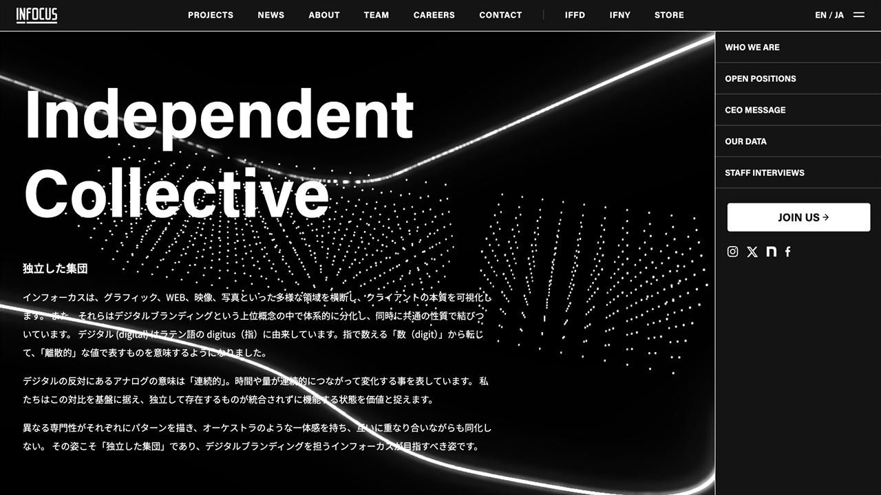
Kaneishi:
In the background of the CAREERS page, there’s a motion graphic inspired by IN FOCUS’s philosophy of being an “independent collective.” Dots repeatedly separate and gather while moving freely, yet continue advancing with a shared identity as a whole. Around them, lightning-like lines crackle with energy and trace unpredictable paths.
The motion expresses the image of IN FOCUS members moving freely across disciplines, each demonstrating their individual talents while collectively generating creative work.
Mr. Kazu:
Another thing I’d like people to check out is the typography animation on the 404 page.
Mr. Kurosu:
You really should see the 404 page. It’s incredibly flashy. When I saw it, I thought they made something amazing. We might even borrow a little inspiration from it for the CREBAR FLAVOR renewal (laughs).
Kaneishi:
Near the very end of the project, we added a lot of the playful details and interactions all at once, including the 404 page. It felt a bit like “painting in the eyes of a daruma doll” at the final stage—like we were finally bringing the essence of IN FOCUS fully to life.
ー A Process of “Building While Moving” — Something Only This Team Could Do
Iguchi:
This time, we worked in a way where” we continuously refined and polished what had already been built.” Honestly, that’s incredibly demanding for the people making it (laughs). It’s not something that’s easy to do in a typical project. But by carefully evaluating and incorporating ideas that emerged during the production process itself, the final outcome became much stronger. CREBAR FLAVOR really stayed with us through that process. Kurosu and Kazu handled an enormous amount of detailed adjustments along the way. Because we’ve worked together for so long, we were able to discuss things openly without hesitation.
Mr. Kurosu:
At one point, I honestly felt like the feedback was never going to stop (laughs). But at the same time, I’m really glad we were able to launch it within 2025. Originally, we had planned to release it earlier, but both sides had other projects progressing simultaneously.
Mr. Kazu:
When the site finally launched, the biggest feeling for me was simply relief—that “we had somehow landed it safely.” As we continued building, whenever a good idea emerged, we tried it. It made me feel like maybe that’s what creation is fundamentally supposed to be. I think the essence of creativity probably exists somewhere in that process.
ー Looking Back After Crossing the Finish Line
Yamada:
Now that the site is complete, with all the motion and interactions added, I feel it has become an experience that keeps people engaged. To be honest, there was definitely pressure to make the renewal feel “even cooler” than before. But the process itself—coming up with countless variations and refining every detail—was genuinely enjoyable. I think the finished site is something we can confidently say is “truly cool.”
Iguchi:
It looks simple on the surface, but there’s a lot of complexity behind it. This website is filled with that kind of thinking. I think one of CREBAR FLAVOR’s strengths is having such a wide range of technical options available. With people like Mr. Kurosu and Mr. Kazu on the team, there are many possible approaches. Over the years, we’ve come to understand “the range they have.” This project could only happen because there was trust—not just technical skill.
Kaneishi:
Because this was an internal project happening alongside our regular client work, we focused on simply getting it moving first—and even if progress slowed down at times, making sure it never completely stopped. I’m just glad we were able to reach the finish line in the end. Through this renewal, I was able to rediscover what makes IN FOCUS unique, as well as the strengths we already have. At the same time, it also helped reveal where we could push things further to become even more interesting.
Mr. Kazu:
Looking back, the original design and direction actually didn’t change all that much from the beginning. But the final result became incredibly refined down to the smallest details. With every round of feedback, you could really feel the quality continuing to improve.
Mr. Kobataku:
It also happened to coincide with our own company entering its tenth term, so we wanted to do something that felt like a milestone. Being able to closely experience IN FOCUS’s approach toward digital branding became a huge asset for us as well. I was genuinely happy to work together with a team that’s always operating at the forefront.
Mr. Kurosu:
Now that the IN FOCUS website has settled down, we’ve started working on the renewal of our own site. Once it’s finished, we’d love for people to check that out too.
Mr. Kobataku:
Also, the sweatshirt I’m wearing right now is actually from IN FOCUS. I bought it at the IN FOCUS exhibition two years ago. I realized I forgot to mention that today. I felt like I had to say it before we wrapped up (laughs).