Alongside working on a wide range of graphic design projects, Anna is also a member of the creative group NIKKAN TYPO, where seven designers create typographic pieces based on a weekly theme. We spoke with her about some of the projects that have stayed with her, what she values in her work, and how she approaches art direction.
Creating Type with Character
- First, could you tell us a little about the kind of work you do?
-
I work in art direction and graphic design. Depending on the project, I might work on anything from websites and logos to key visuals. I’m also a member of a group called NIKKAN TYPO, where seven designers take turns creating a piece of lettering based on one weekly theme. I’m in charge of Fridays.
- Could you tell us a little more about NIKKAN TYPO?
-
There are seven designers, and each of us is assigned a day of the week. I’m Friday, so I post every Friday—which means no Friday-night plans for me. (laughs) There are so many talented art directors in the group, so I learn a lot from them. We also participate in a lot of events, and I try to attend whenever I can. It’s really encouraging when people who follow our work tell me, “I always look forward to your posts.”
- You also seem to work on a lot of type-based design at IN FOCUS.
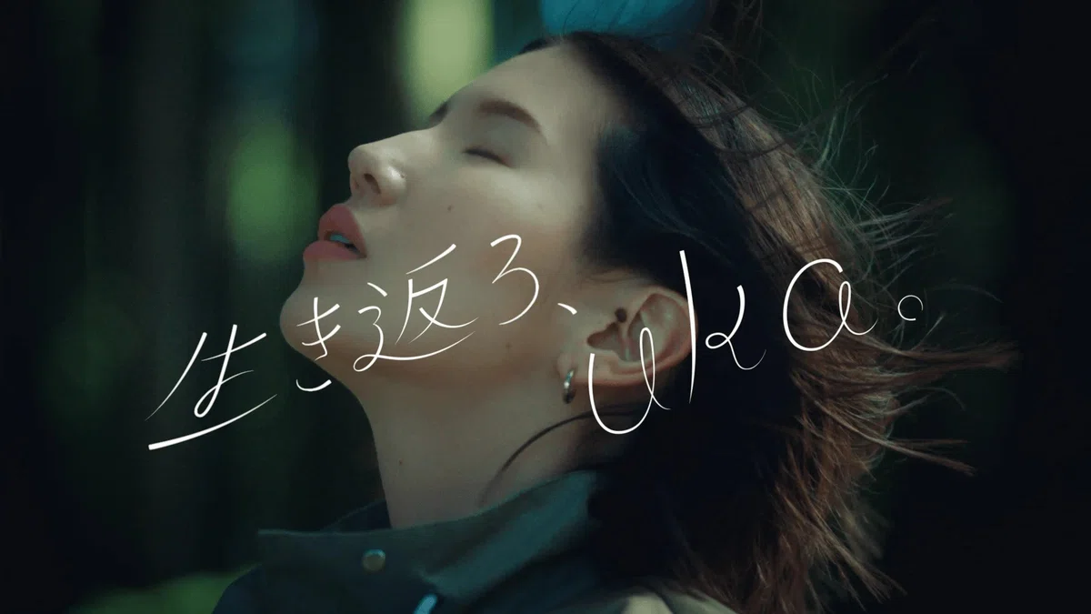
For example, the catchphrases for uka’s “Regenerative Good Series.” -
Uka was one of the first projects I worked on after joining IN FOCUS. They asked me to design the catchphrases that appear in the videos. At the time, I didn’t necessarily think of lettering as one of my strengths, but seeing how beautifully the type was used in the final videos made me really happy I had worked on it. And getting feedback from art director Yu Takada was especially exciting for me.
- The design really captures the atmosphere of the brand. Is there anything you particularly keep in mind when creating lettering?
-
I focus on the theme and build the forms around it. For this project, I explored different shapes with “a sense of comfort” as the starting point. If you’re simply looking for well-designed, polished lettering, there are already plenty of fonts that can do the job. I think when someone asks you to design the type itself, they’re looking for something beyond beauty—some kind of nuance. That’s why I think it’s important to leave certain parts open or imperfect. I also pay attention to whether the lettering fits naturally with the atmosphere of the video or photography. Finding that balance is really important to me.
- I hear you also worked on the logo for Grand Palace Hirosaki.
-
Yes. It’s a complex that was created by renovating a snack-bar building that still retains the atmosphere of the Showa era. I worked on both the website and the logo. A lot of the people who come to me are looking to create something where typography plays a key role, and this project was no exception. I got to create various pieces of lettering throughout the building. It’s an area I really enjoy, so I had a lot of freedom and fun with the design. I was really happy when people said that it fit the atmosphere of the building so well.
I also suggested incorporating illustrations. I wanted to make the most of the retro atmosphere, so we asked illustrator Yukiko Katayuki to create them.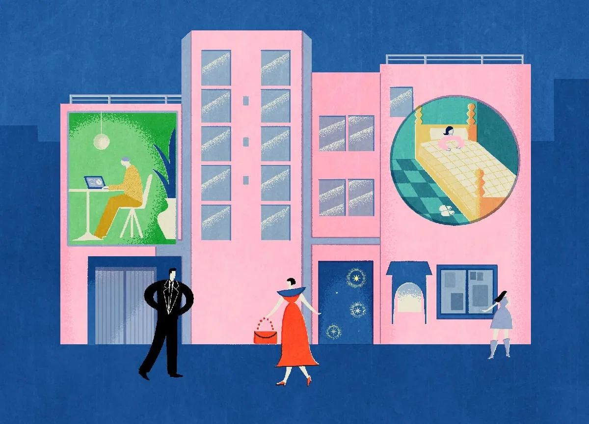
A “snack bar-style” complex that makes the most of its atmosphere. Retro and charming illustrations were commissioned from Katayukiko.
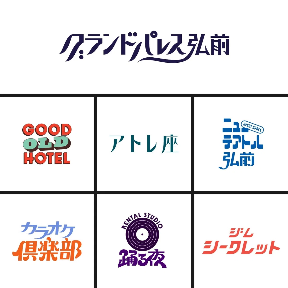
Logos designed for various facilities, including a theater, café & bar, hotel, office, dance studio, gym, and restaurants.
The Joy of Discovering the Unknown in Illustration
- I understand that you also enjoy directing illustration projects. Are there any projects at IN FOCUS that have particularly stayed with you?
-
One is JRA’s “Roppongi Hills Christmas.” It’s an illumination event that brings Roppongi Hills to life during the Christmas season, and I worked on the art direction and graphic design for various materials. I worked on it together with Tsukidate from the graphic team, and it was actually the first project where I took on the role of art director. There’s a competition every year, and this will be our third year working on it. I’m really happy that we’ve been able to continue being involved.
- What kind of direction were you aiming for?
-
I wanted to bring out the mature and refined character of Roppongi. We chose an illustrator with a slightly classical style, and aimed for an output that felt classic and elegant.
With illustration, the final result can change depending on how you perceive things and how you see color. I find it interesting to see something come together that goes beyond what I imagined.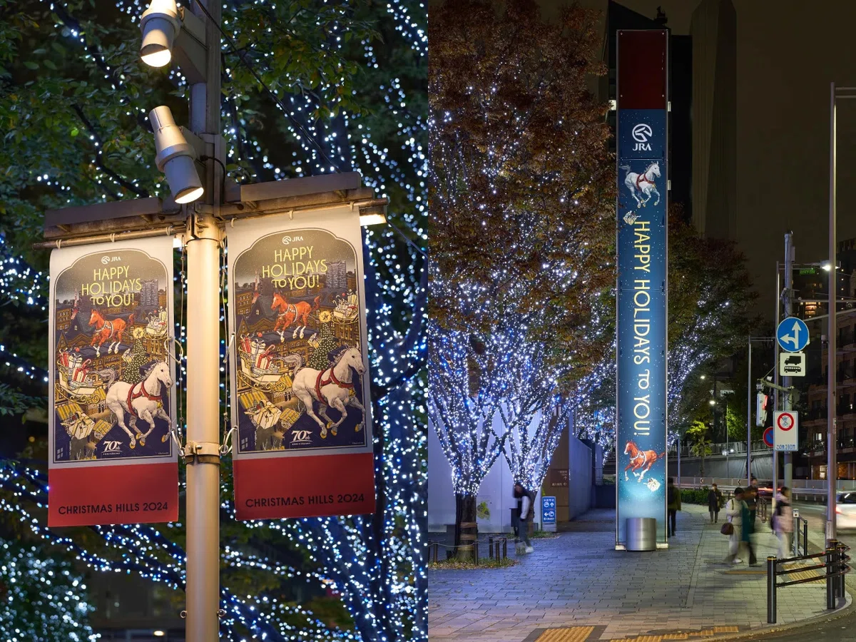
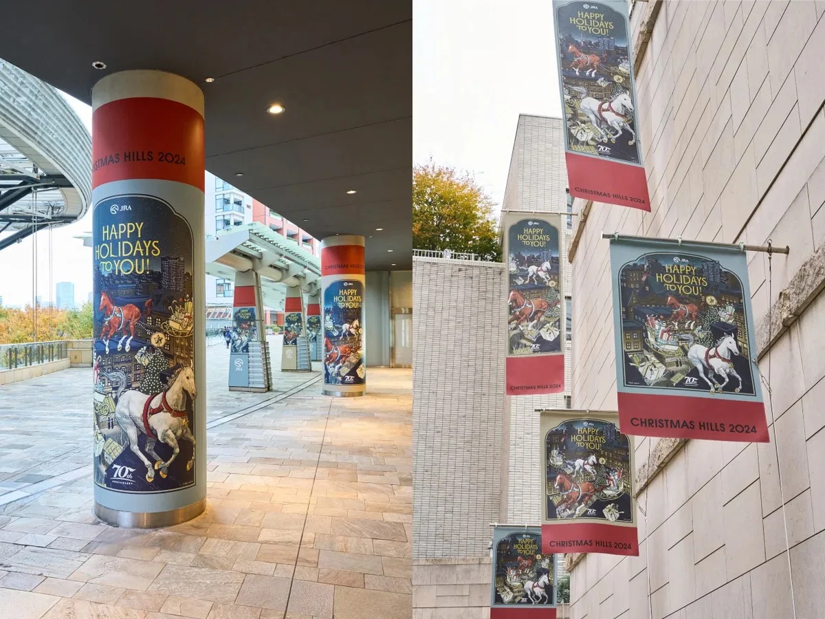
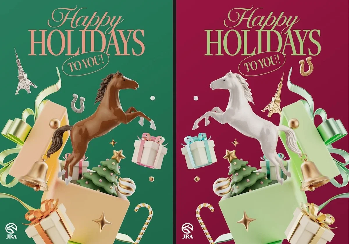
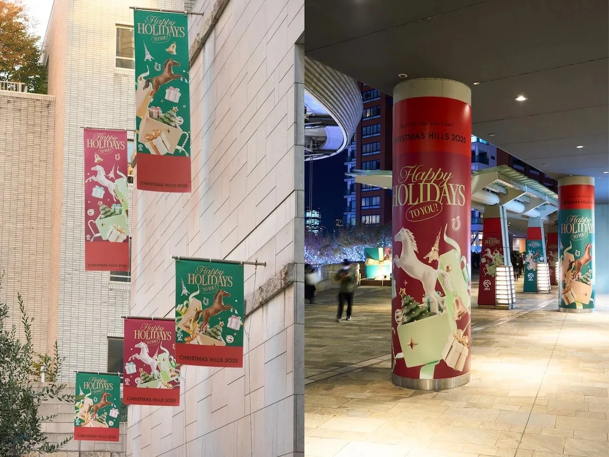
Directed and designed various applications, including the key visual, sidewalk banners, and column wraps.
- You’ve also been involved in the manga label “Yosumi” for some time now.
-
Yes. SORAJIMA, a company specializing in Webtoons, invited us to participate in a logo competition because they wanted to create a horizontal-reading manga platform with a strong focus on culture. After our logo was selected, the project expanded into the website and key visual production. We also created a character-like logo and key visuals for the works featured on the platform. For the recently published second volume of Bessatsu Yosumi, we also handled the cover design and art direction for the pages.
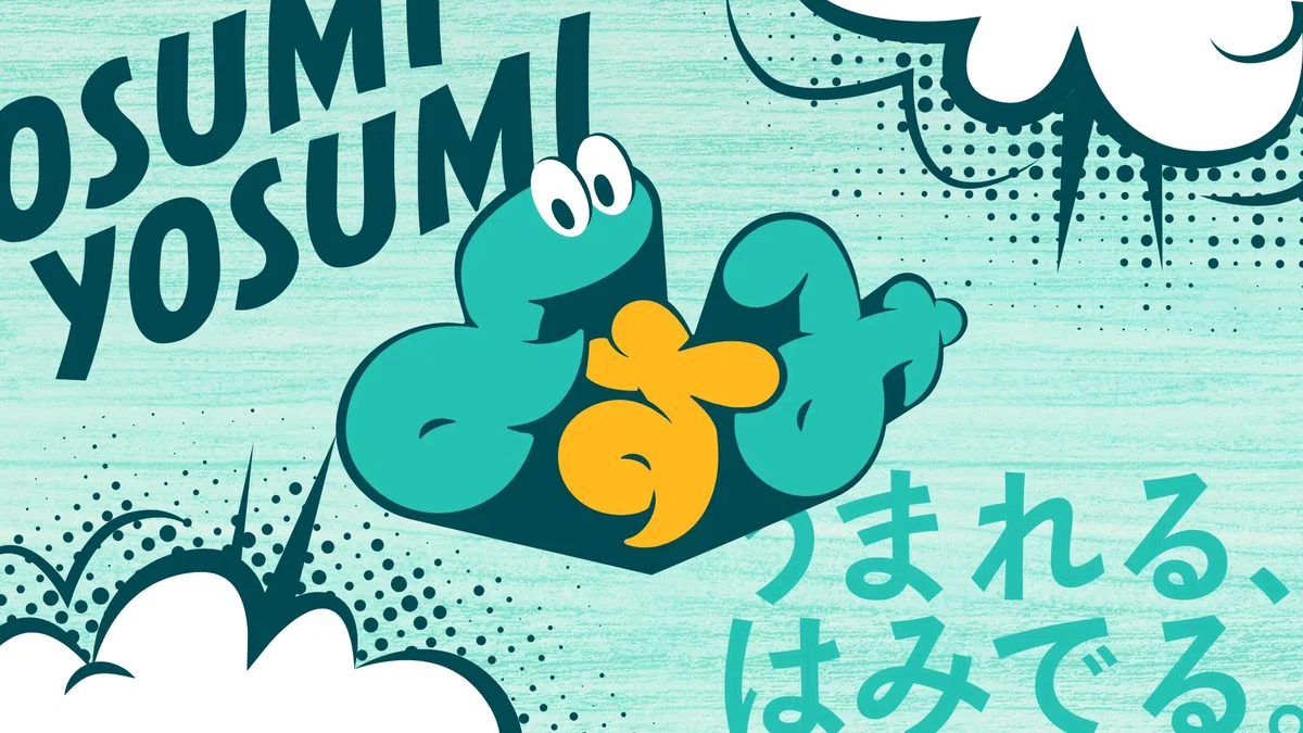
The logo evolved into the character “Yosumi-kun.”
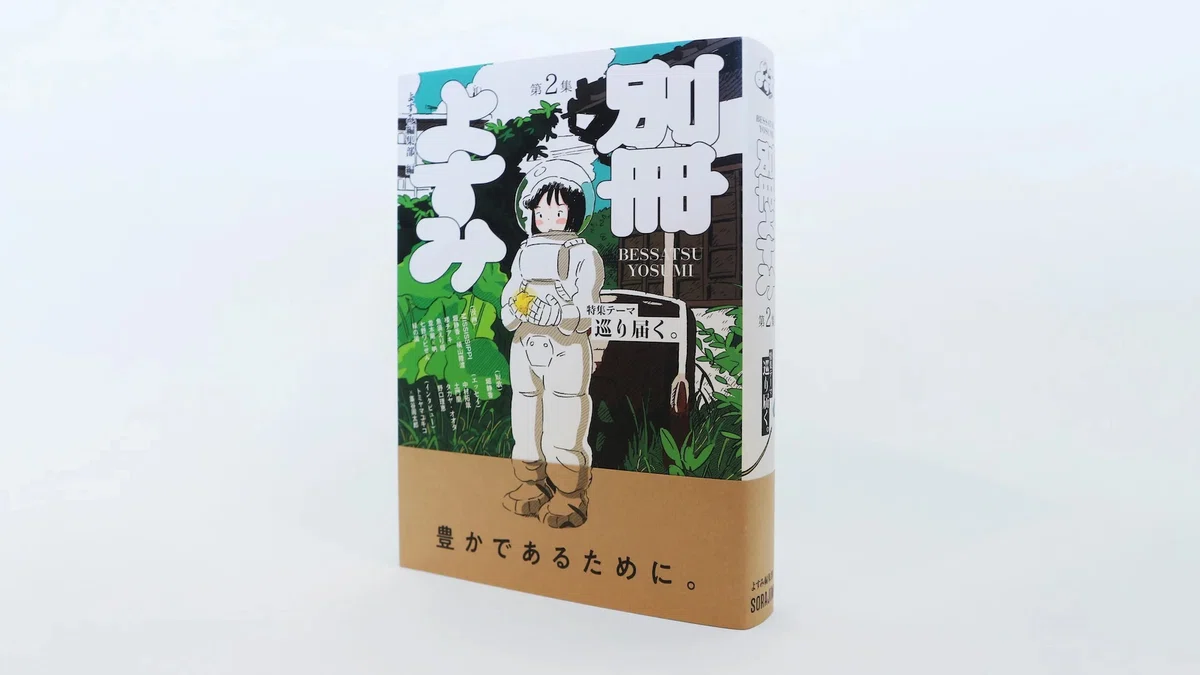
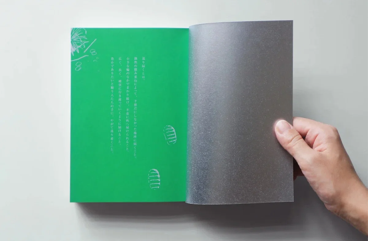
Cover design and art direction/design for the article pages.
From “Boredom” to a Career in Design
- You mentioned that you had no design experience when you graduated from university.
-
My first job was at a recruitment agency, and I remember thinking, “This is so boring!”. I couldn’t imagine myself continuing to work there for years, so I thought, “Then I should just do something I actually like.” Looking back, I realized that I had always enjoyed creative expression. I had done calligraphy, theater, and dance as a student.
At the recruitment agency, I was responsible for arranging outsourced work, so I looked at designers’ portfolios every day. I noticed that many of them hadn’t graduated from art school or design school. That made me realize, “Oh, you can become a designer as an ordinary person. Maybe I can do it too if I develop the right skills.” That’s what ultimately led me to decide to switch careers without any prior experience.
- How did you get started?
-
The first thing I focused on was building up my portfolio. Since I had no experience, there was no way I could compete with people who were already skilled at design. So I included a lot of text explaining the thinking behind each project and why I had made certain decisions. I knew I couldn’t win based on technical skill, so I wanted people to see my potential instead. I was self-taught, but I think I was able to figure out a fairly direct route toward my goal. I don’t really like being stuck in indecision, so maybe I naturally have a tendency to just take action quickly.
- You eventually became a web designer. What made you decide to join IN FOCUS?
-
As a web designer, I reached a point where I felt like I had done everything I wanted to do in that field. I started wanting to create things that people would encounter in their everyday lives and in the city. I’ve also always loved book design and things that have a physical presence—objects that stay in your memory.
Around the same time, I was posting my work on social media as a kind of portfolio, and I started receiving logo design requests directly from people. That’s when I began to see a future for myself as a graphic designer.
I chose IN FOCUS for the appeal of working across different disciplines, from graphic design to film and web, and for the sense of security that comes with not relying on just one specialty. Each team works on different kinds of projects, and even within the graphic team, everyone feels quite independent. But I think there’s one thing we all have in common: we genuinely love making things.
Creating Beyond Expectations by Keeping Things Fun
- What do you consider important as an art director?
-
I think it’s about assigning the right people to a project and bringing out the best in each of them. An art director needs to understand the client’s vision, bring together the right people to make it happen, and make sure everyone shares the same goal. I think good things happen when each person is able to fully demonstrate their own expertise.
It can be challenging because a project can’t be completed through my own abilities alone, but that’s also what makes it interesting. When I’m directing a project, I want the final result to be better than what I initially imagined. I’m still figuring out how to create that kind of jump.
- What do you do to bring out the best in the people you work with?
-
It depends on the person. Everyone has a different amount of information they need in order to create their best work, so I adjust how I communicate depending on who I’m working with. In general, I think I tend to leave some room for “fun” in the way I give direction.
For example, when I’m creating a brief for an illustrator, even if I have a very clear idea of what I want, I might intentionally turn it into a rough, loose sketch. That makes it easier for something beyond my own imagination to come back. Of course, there are also times when I think, “Maybe I should have explained that in a little more detail.”
At the same time, I think it’s important to have a clear sense of what I believe is good. There are people who try to find a compromise between what they want to create and what the client wants. I’m actually the type who tends to automatically lean toward the client’s perspective.
So if there’s a revision that feels like it’s moving away from the original direction, I try to communicate my thoughts first. Then, together, we can figure out what the best outcome should be. I also try to propose something that’s one step beyond the future the client is imagining.
- How have you developed that sense of what you consider “good”?
-
Both figuring out the core tone of a project and recognizing the strengths of different creators come from my own experience and knowledge.
That’s why I try to actively take in things that other people consider good. Staying at a great hotel, going out for a really good meal—things like that. I think it’s important to experience a wide variety of things rather than limiting yourself to only what you already like.
- Finally, what are your goals for the future?
-
Regardless of the genre, I’d like to have more projects where clients come to me specifically because they want my work. When someone already likes my style, there’s less of a gap between what they expect and what I create, which makes the process smoother. It also creates more consistency and affinity in the final output. More than anything, it makes me happy when someone says, “I asked you because I wanted you to do it.” To make that happen, I want to keep expressing more of myself in my work rather than simply adapting completely to the client.