
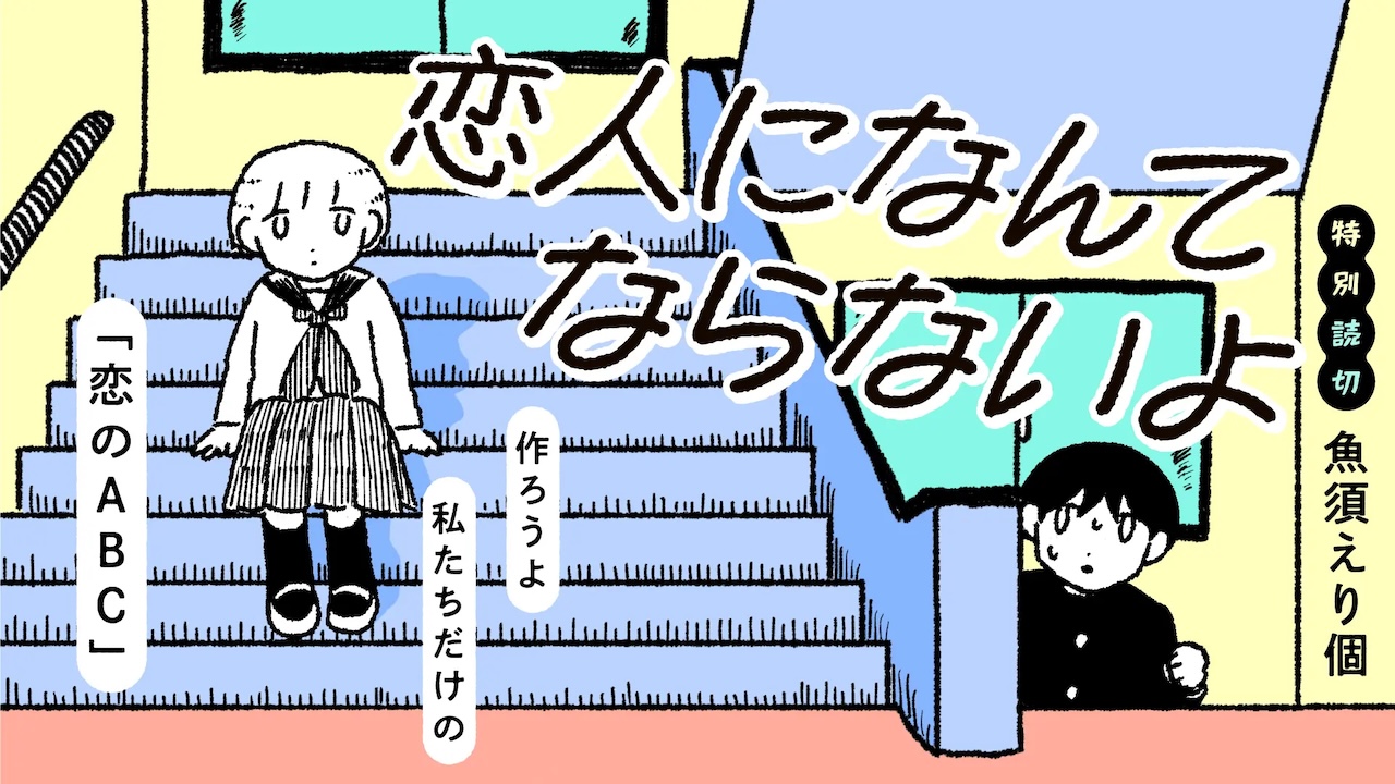
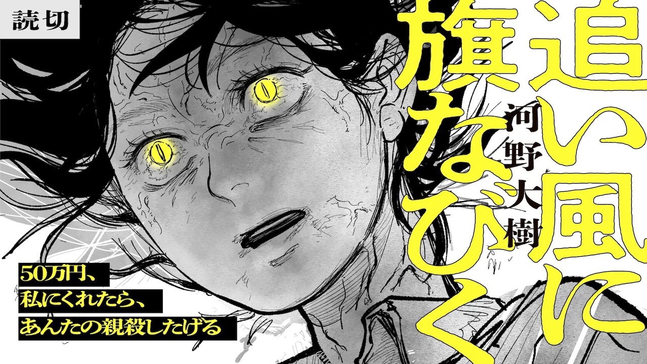
A new horizontal-reading manga label, “Yosumi,” has been launched by SORAJIMA, a manga publisher known for producing and distributing “Webtoons”—full-color, vertically scrolling digital comics optimized for smartphone viewing.
IN FOCUS was in charge of the design of the label logo and website. We also created key visuals for selected titles.
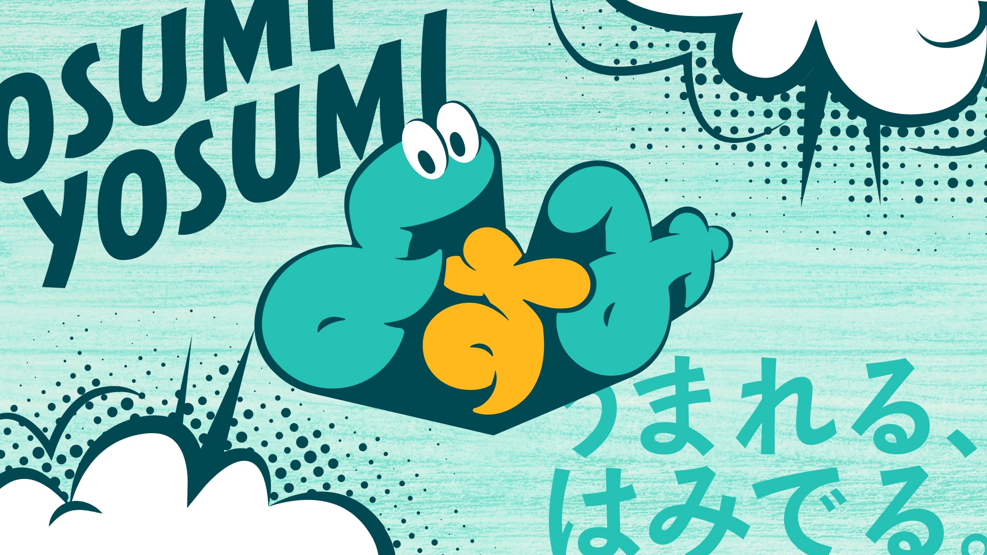
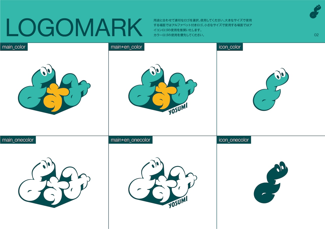
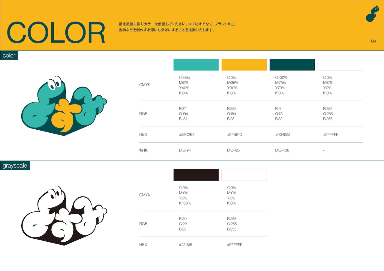
A character is subtly embedded within the logo and named “Yosumi-kun.” The intention was to express the idea of breathing life into the stories created under the label. For the website, rather than prioritizing readability, we emphasized “the experience of searching for and discovering content oneself.” As a result, the site is designed to scroll in all directions rather than following a conventional vertical-scroll format.
Yosumi
https://yosumi.jp/
CREDITS
ART DIRECTION / DESIGN : Anna Senzaki (IN FOCUS)
CLIENT : SORAJIMA